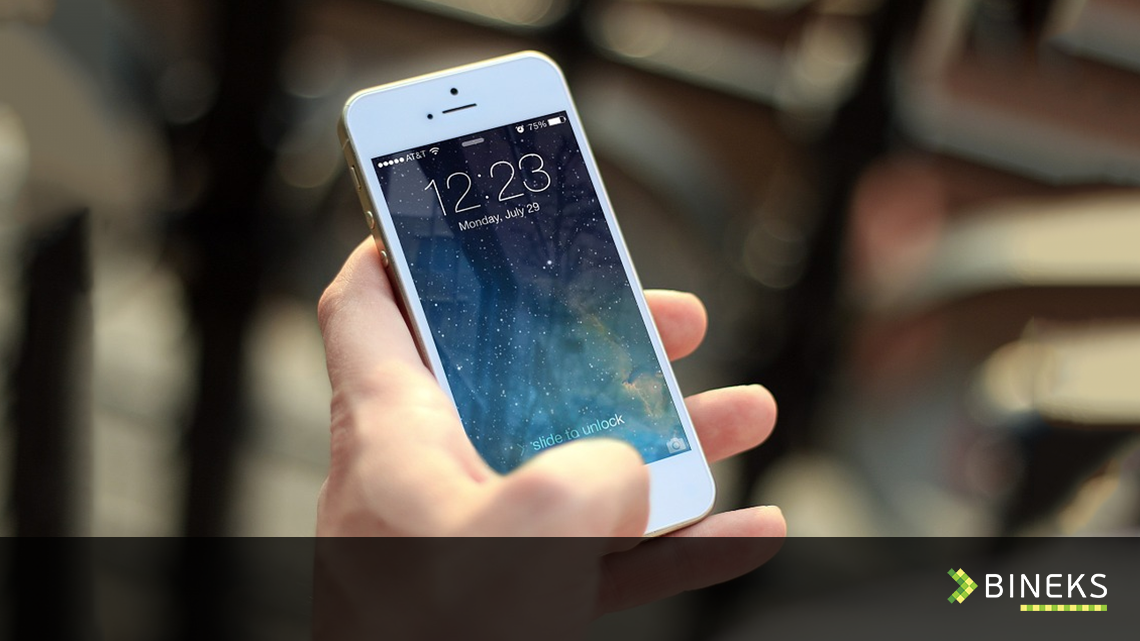
Apple products have their own specifics and as web developers we often face difficulties that this may cause for layout developers. Here are 10 tips on some specifics to mind when adjusting layout for iPhones:
Tip#1 – favicon.ico analog:
Case: When a user creates an icon with a link to a website on SpringBoard, iPhone automatically generates an image from a page general layout. As a result in almost every case you get a messy image that hardly can be called na icon.
Solution: Use <link rel=”apple-touch-icon” href=”res/iphone_icon.png” /> and add a corresponding image
res/iphone_icon.png with a size of 57*57 pixels. iPhone will add round edges itself, and apply filters to give your icon an iPhone-buttony look.
Tip#2 – Full screen size
Аdding this status: <meta name=”apple-mobile-web-app-capable” content=”yes” /> will give your website a look of an application when opening from the SpringBoard (neither search bar nor the bottom toolbar will appear).
Please make sure that your website has good navigation as the browser ‘back’/’forward’ buttons won’t be available when using this solution.
Tip#3 – disabling automatic correction of scaling
If your website use AJAX requests or just JavaScript for dynamic change of the page content you could face some unnecessary text scaling when changing DOM or displaying/hiding of some elements.
The following CSS code will disable default scaling of Safari browser and withdraw these unnecessary effects:
html {
-webkit-text-size-adjust: none;
}
Tip#4 – Absolutes
Avoid using absolute width where you can use the width with percentage. Align everything you can and avoid using of floating blocks. Avoid dividing text into columns if possible. First thing you should need to do to handle font resizing is installing a special style for WebKit webkit-text-size-adjust – this attribute will manage resizing of the fonts on your website automatically.
Tip.#5 – Mind specifics of hover effects on iPhone.
iPhone has its own specifics of hover effect – with a first tap hover effect is triggered and with the second tap the even click is triggered. This should be always kept in mind and hover should be disabled for all the elements that should work as ‘click’ or ‘touch’ when the detected device is iPhone. This is a sample code that could help you to avoid double tap for triggering click/touch events:
$(‘a’).on(‘click touchend’, function(e) {
var el = $(this);
var link = el.attr(‘href’);
window.location = link;
});
